Accounting Portlet ABANDONED
Contents
Introduction
This portlet allows the users of the infrastructure to view the accounting information (based on the resources consumption and collected by the services) both in a report form (aggregated data) and is raw form (single accounting information).
Below is shown the overall layout of the Accounting Portlet:
Reports
The purpose of the portlet is to have the views and the data customized by the user roles and the scopes, avoiding to present all accounting records as the first glance and showing some reports by resource type. For each report there are filter and aggregation options. In particular, for each resource type is possible to select a specific report. Besides, for each resource type all the options related to the data filtering and/or aggregation are specific.
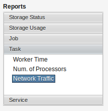
Below is shown an example of the available reports for the Task resource type:
For each resource type (defined in the common-accounting-model) are available different type of report. Following a complete description of these reports:
Storage Status
(1) Volume : represents the latest dataVolume value. (2) Entities : represents the latest dataCount value.
Additional dimension (and filters) : dataType, providerID.
Storage Usage
(1) Volume : represents the sum of the dataVolume values (DELETE operation is not considered). (2) Num. of Entities : represents the sum of the dataCount values. (3) Num. of Operations : represents the number of storage operations, obtained by counting the common ids.
Additional dimension (and filters): dataType, operationType.
Job
(1) Elapsed Time : represents the sum of execution times of the jobs. (2) Net Elapsed Time : represents the total wall clock time elapsed, obtained by summing the wallDuration values. (3) Num. of Jobs : represents the number of jobs, obtained by counting the job ids.
Additional dimension (and filters): domain, jobStatus.
Task
(1) Worker Time : represents the sum of the execution times of the tasks. (2) Num. of Processors : represents the number of processors, obtained by summing the processor values. (3) NetworkTraffic : represents the consumption of the network resource, obtained by summing the overallNetwork values (two results, one for network input and one for network output).
Additional dimension (and filters): domain, jobStatus.
Service
(1) Num. of Operations : represents the number of operations, obtained by counting the invocationCount values. (2) Avg Invocation Time : represents the average invocation time, obtained by averaging the averageInvocationCount.
Additional dimension (and filters): ServiceClass, ServiceName, domain.
Timeline graph
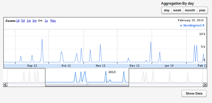
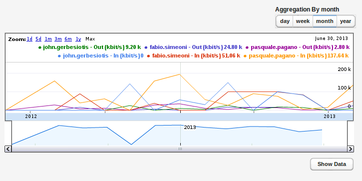
This is the main section of the portlet. A user can select different zoom options, slide the graph moving the cursor at the bottom or dragging the graph.
In the up-right side there is the “Aggregation By” option. This section allows the user to change the aggregation granule of the report. Below the graph there is the button to show raw accounting data used to generate the accounting report.
Context
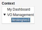
This menu shows the context information of the user logged in on the portlet. According to the user’s roles, in the Context section is shown a subsection for each Infrastructure/VO/VRE where the user is manager/admin. Besides, is always shown the subsection “My Dashboard” which covers the set of the accounting information where the user is directly involved.
Time period
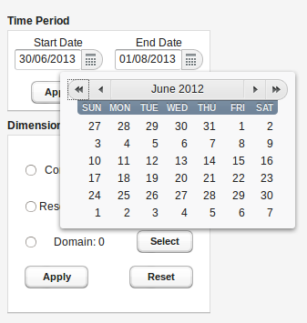
This section allows the user to select a time range of interest for the accounting report. The default value is the last month.
Dimensions and filters
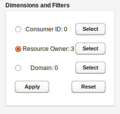
Each report/graph data can be filtered either on some common dimensions for all the available resource types and on some specific dimensions. Each resource type has a contextual section of filters. The following menu allows users to select values of these filters clicking the related Select button.
The left side of the “Dimension and Filters” section allows the user to select, through a radio button, a dimension that will be shown in the graph (by different colors). If the user select "No dimension" option, only filters will be used to build the graph, without showing dimension.
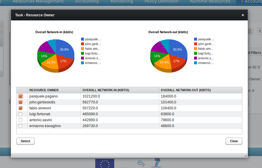
The filter selection is guided by a popup that shows both a pie chart and a table which representing the rating information of the selected filter. These information are useful to more easily select the values on which to apply the selected filter. Indeed, this representation shows at a first glance the values in descending order, then allows the user to understand the “resource” consumption against a particular field.
Below is shown an example of timeline graph with selected dimension and filters:
Each line represents a combination of three factors: report type, selected dimension and selected filters.
Installation
- Install Vaadin Control Panel for Liferay portlet (vaadin-controlpanel-for-liferay.war)
- The menu path for Vaadin Control Panel is Manage → Control Panel → Vaadin
- Use Vaadin Control Panel to update Vaadin to version 6.8.12
- Copy libraries below to following path /home/portal/tomcat-6.0.29/webapps/ROOT/WEB-INF/lib/
- ButtonGroup-1.2.jar
- flexibleoptiongroup-1.1.0.jar
- VaadinVisualizations2.1.jar
- gwt-visualization.jar
- Click on [re-scan] in Vaadin Control Panel
- Select ButtonGroup 1.2, FlexibleOptionGroup 1.1.0 and VisualizationsForVaadin 1.1.2
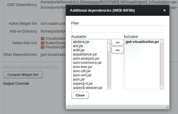
- Click on Manage Additional Dependencies and select the dependency gwt-visualization.jar
- Click on Compile Widget Set
- Install the accounting portlet

